Learning Outcomes
i. Upon successful completion of this lesson, students will be able to:
ii. Identify Microsoft Excel as a powerful tool for organizing, analyzing, and visualizing data.
iii. Navigate the basic structure of Excel spreadsheets, including cells, rows, columns, and worksheets.
iv. Enter and manipulate data within Excel spreadsheets, utilizing formulas, functions, and data validation tools.
v. Create and customize charts and graphs to effectively present data and insights.
vi. Apply Excel's data analysis tools to extract meaningful information from data sets.
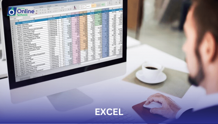
Introduction
In the realm of data management and analysis, Microsoft Excel stands as an indispensable tool, empowering users to organize, manipulate, and visualize numerical information. This lesson delves into the world of Excel, guiding students through its fundamental concepts, data manipulation techniques, and visualization capabilities, transforming them into data mavericks.
i. Deciphering the Spreadsheet Landscape: Cells, Rows, Columns, and Worksheets
An Excel spreadsheet is a grid-like structure composed of cells, the basic building blocks for organizing and manipulating data. Rows, horizontal arrangements of cells, provide a structured way to store data records. Columns, vertical arrangements of cells, facilitate comparisons and analysis across different categories. Worksheets, multiple sheets within a single Excel file, allow for segregation of data and organization of complex information.
ii. Data Manipulation: Taming the Numbers
Excel empowers users to effortlessly enter, modify, and analyze data within spreadsheets. Data entry involves simply typing values into cells. Data manipulation techniques, such as copying, pasting, and sorting, enable efficient organization and arrangement of data. Formulas, mathematical expressions within cells, perform calculations and transform raw data into meaningful insights. Functions, predefined formulas within Excel, provide a vast array of specialized calculations for data analysis. Data validation tools, such as input masks and drop-down lists, ensure data accuracy and consistency.
iii. Charts and Graphs: Visual Storytelling with Data
Excel surpasses mere data organization by transforming numerical information into captivating visual representations. Charts and graphs, a visual language for data, allow users to communicate trends, patterns, and relationships within data sets. From bar charts to line graphs, Excel offers a diverse array of chart types to suit the specific needs of the data and the intended audience. Chart customization, ranging from color schemes to data labels, empowers users to create visually appealing and informative presentations.
iv. Data Analysis: Unlocking Insights from Data
Excel's data analysis tools extend beyond mere organization and visualization, enabling users to extract meaningful insights from data sets. PivotTables, interactive summaries of large datasets, provide a structured way to analyze, filter, and summarize data. Data analysis functions, such as SUM, AVERAGE, and COUNT, perform complex calculations and condense data into meaningful summaries. Data filtering techniques allow users to focus on specific subsets of data, revealing hidden patterns and trends.
Microsoft Excel stands as a gateway to the realm of data management and analysis, empowering individuals and organizations to organize, manipulate, and visualize numerical information. Its comprehensive set of tools, ranging from data entry to visualization and analysis, transforms raw data into meaningful insights that drive informed decisions. As technology continues to evolve, Excel remains a cornerstone of data literacy, enabling users to navigate the ever-increasing volume of data with confidence and skill.
